facts
Subject:
Valkea Shopping Centre
Customer:
Osuuskauppa Arina cooperative
Timeframe:
2015-2016
Scale:
Kööki restaurant 2,000 sq m and Herkku restaurant 130 sq m
#designbyamerikka:
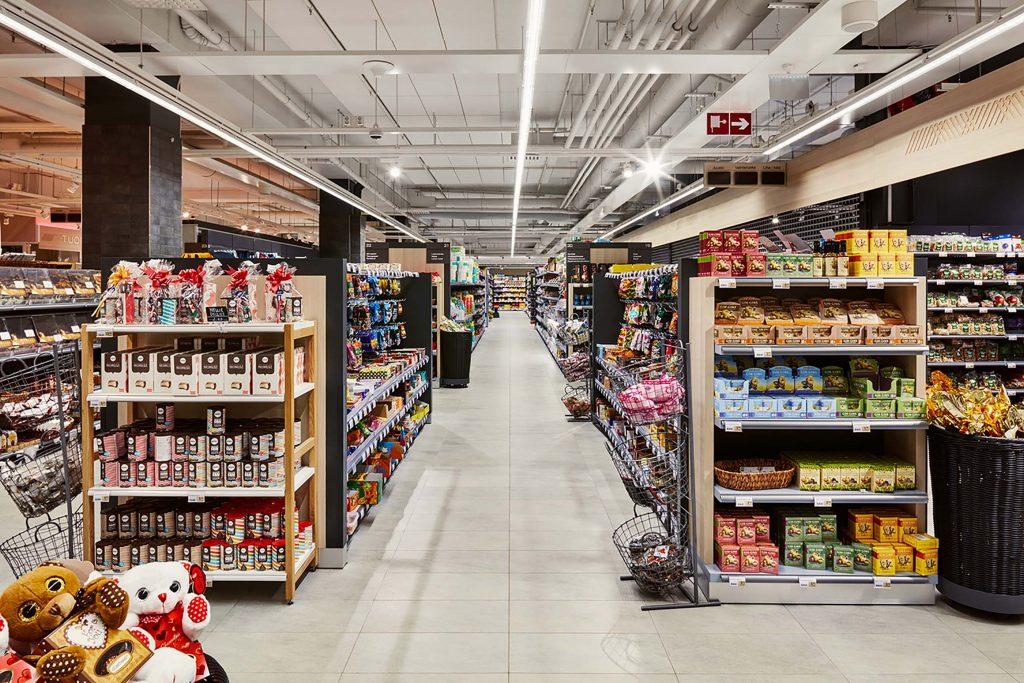
Layout and interior design for Valkea shopping centre food court. Interior design for Herkku and interior visuals for supermarket.
Top 3
- Exciting use of colours and materials
- Quirky design with unexpected elements
- Authentic, Finnish, fresh
Project team
- Amerikka team: Sami Maukonen, Emma Penttinen, Taija Maunu, Teemu Nojonen ja Mervi Karvinen
- Graphic design by Marker
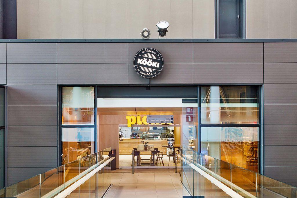
Valkea shopping centre in the northern Finnish city of Oulu comprises two urban blocks and a covered walkway that connects the two halves. The Kööki food court on the second floor is a key part of the wider shopping centre and its brand image. Amerikka was responsible for the conceptual and spatial design and project management here, as well as Sokos Herkku’s in-store restaurant.
Background:
The restaurants are a significant pull factor for the new shopping centre. The brief was to create an exciting visual identity for the restaurants that is relevant and appealing to customers. Convenience, accessibility and functionality, for customers and business alike, were the key concepts that informed the design process, along with visual appeal and visitor comfort.
Kööki:
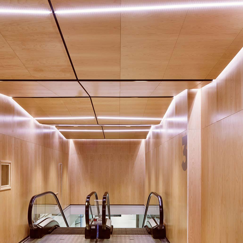
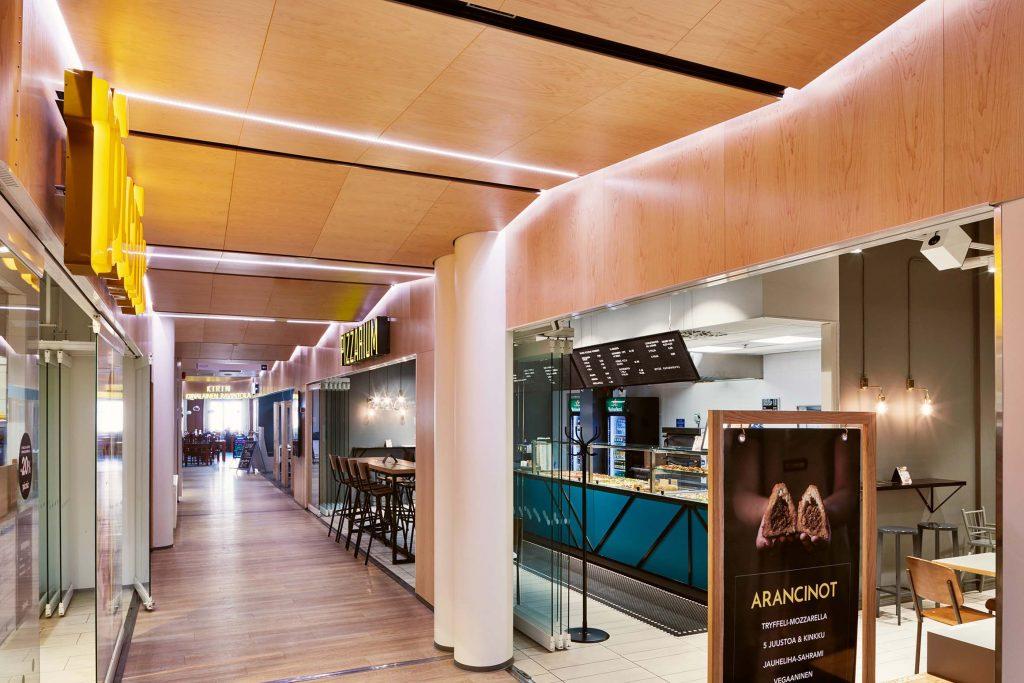
Kööki’s look is calm, warm and relaxed. We used light wooden finishes and bespoke lighting that turns the dining room ceiling into an unexpected visual feature. It is built using interspersed LED strip lights and rectangular sheets of wood installed in an angular pattern. A path leads to the bright and cheerful Pikkukööki play area. With colourful walls and floors, green seating and eye-catching wall designs, Pikkukööki is a real food court highlight and a firm favourite among the youngest visitors.
At Amerikka, we also created a Tenant Manual for Kööki, which provides a wealth of information on the shopfronts and the visual identity internally. Marker designed the new Kööki logo and was also responsible for the Tenant Manual graphic design.
Herkku:
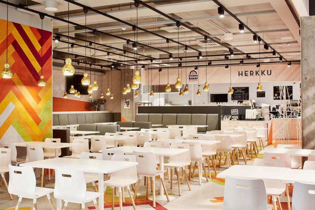
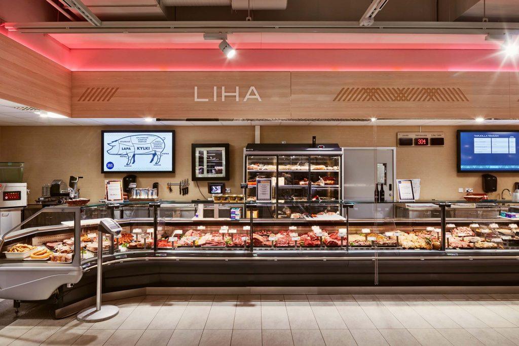
Sokos Herkku, the most luxurious food shop in northern Finland, is complemented by a colourful and distinctive restaurant of the same name. The carefully chosen colour scheme is designed to catch the shoppers’ attention, and the cosy and welcoming space acts as a pull factor for other shopping centre visitors. Efficient use has been made of the available space here, the materials and finishes have been carefully chosen, and there is a wealth of clever details, making this ideal space for all sorts of occasions. The stylish visuals and high-specification materials were extended across to the Sokos Herkku food store. The ash counters and attractive store furniture add a touch of luxury and lend the store a distinctive feel.
